Wireframes
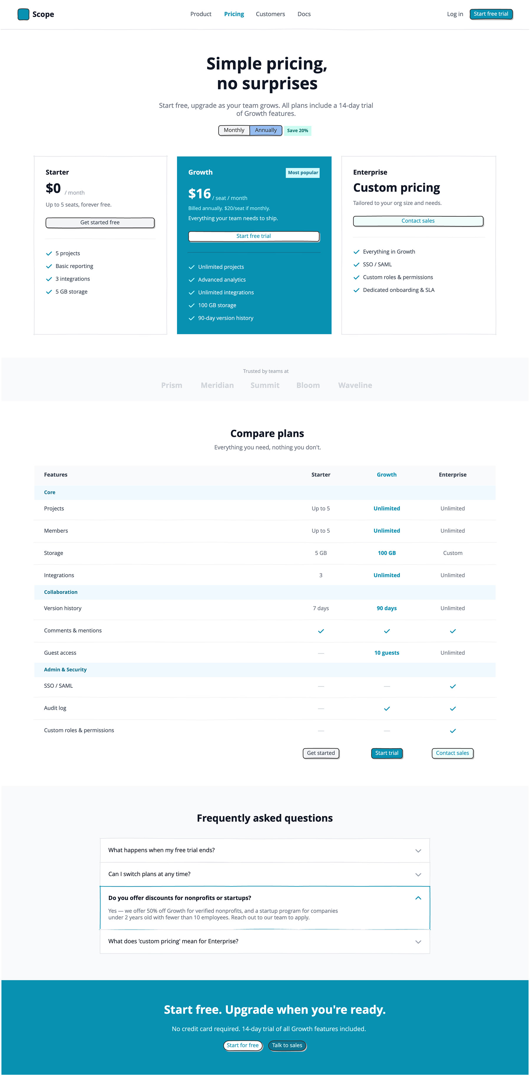
A single wireframe showing a billing toggle with an annual discount badge, three pricing cards with distinct visual treatments, a social proof bar, and a sticky-header feature comparison table broken into three feature categories.
The comparison table is the most detailed part of the example and is usually the point of the most discussion when launching a pricing page update.
The fast way
Recreate this in Balsamiq AI
Paste this prompt into Balsamiq AI to generate a similar flow, then edit any line to make it yours.
Swap the brand name, change the colors, add or remove steps and fields.
Prompt for Balsamiq AI
Prompt generates AI designs. Results may vary.
Create a single long-scroll pricing page board, 1280px wide, for a fictional project management tool called Scope. The accent color throughout is teal (#0891B2). The page is mostly white with light gray (#F9FAFB) used for alternating sections. Section headers inside the comparison table use a very light blue tint (#F0F9FF). The final CTA band is solid teal.

Navigation bar
A clean white nav, 64px tall, with a thin light gray border (#E5E7EB) along the bottom. On the left, a small teal rounded-square shape sits next to the word "Scope" in bold dark gray (#111827), 18px. In the center, four nav links — Product, Pricing, Customers, Docs — where "Pricing" is bold teal to indicate the active page, and the rest are medium gray (#4B5563), 14px. On the right, a "Log in" text link in medium gray next to a solid teal button labeled "Start free trial" with white text.

Page header
Centered column, padded 56px top and 48px bottom. A large two-line headline in dark gray (#111827), 40px bold, centered: "Simple pricing, / no surprises". Below it, a line of subtext in medium gray (#6B7280), 16px, 520px wide, centered: "Start free, upgrade as your team grows. All plans include a 14-day trial of Growth features."
Below the subtext, a billing toggle — a segmented button bar showing "Monthly" and "Annually", with "Annually" selected — next to a small pill badge in pale teal (#CCFBF1) with dark teal text (#0F766E) reading "Save 20%".

Pricing cards
Three equal-width cards side by side, padded 80px on the sides, 56px bottom, 24px gap between cards. All cards are the same height and stretch to match each other.
Starter card — white background, gray border (#E5E7EB), 28px padding inside. Title "Starter" in bold dark gray, 16px. Price "$0" in bold dark gray at 36px, followed by "/ month" in light gray, 13px. Description: "Up to 5 seats, forever free." A light gray button below: "Get started free". A thin gray divider line. Then four checkpoints with teal check icons (#0891B2): "5 projects", "Basic reporting", "3 integrations", "5 GB storage".
Growth card — solid teal background (#0891B2), no border, 28px padding. Top row: "Growth" in white bold 16px on the left, a small pale teal badge (#CFFAFE) on the right reading "Most popular" in dark teal (#0E7490) bold 11px. Price "$16" in white bold at 36px, "/ seat / month" in light teal (#A5F3FC) 13px. Below: "Billed annually. $20/seat if monthly." in light teal 12px, then "Everything your team needs to ship." in pale teal (#CFFAFE) 13px. A white button with teal text: "Start free trial". A teal divider line (#0E7490). Then five checkpoints with lighter teal check icons (#A5F3FC) and soft white text (#E0F2FE): "Unlimited projects", "Advanced analytics", "Unlimited integrations", "100 GB storage", "90-day version history".
Enterprise card — white background, gray border, 28px padding. Title "Enterprise" in bold dark gray, 16px. Below it, "Custom pricing" in bold dark gray at 28px. Description: "Tailored to your org size and needs." A pale teal button (#F0FDFA) with teal text: "Contact sales". A thin gray divider. Then four checkpoints with teal check icons: "Everything in Growth", "SSO / SAML", "Custom roles & permissions", "Dedicated onboarding & SLA".

Social proof bar
A light gray (#F9FAFB) band, padded 24px top and bottom, all content centered. Small text in light gray (#9CA3AF): "Trusted by teams at". Below it, five fictional company names side by side in pale gray (#D1D5DB), bold, 18px, 48px apart: Prism, Meridian, Summit, Bloom, Waveline.

Feature comparison table
White background, padded 80px on the sides, 64px top and bottom.
At the top, centered: a heading "Compare plans" in dark gray bold 24px, and below it "Everything you need, nothing you don't." in medium gray 14px.
32px below the heading, a sticky-style column header row on a light gray (#F9FAFB) background, 48px tall, with the following four cells in a row: "Features" in bold dark gray 13px (takes all remaining width), then three fixed 160px cells — "Starter" in bold dark gray 13px centered, "Growth" in bold teal (#0891B2) 13px centered, "Enterprise" in bold dark gray 13px centered.
Below the header, three grouped feature sections, each starting with a teal-tinted section header strip (#F0F9FF), 36px tall, with the section name in bold dark teal (#0E7490) 12px.
Core section:

Four feature rows, each 44px tall, with a thin light gray divider (#F3F4F6) between them. Each row has the feature name in dark gray 13px on the left (flexible width) and three 160px value cells centered. Values:

Projects: "Up to 5" / "Unlimited" (teal, bold) / "Unlimited"
Members: "Up to 5" / "Unlimited" (teal, bold) / "Unlimited"
Storage: "5 GB" / "100 GB" (teal, bold) / "Custom"
Integrations: "3" / "Unlimited" (teal, bold) / "Unlimited"

Collaboration section:

Three feature rows:

Version history: "7 days" / "90 days" (teal, bold) / "Unlimited"
Comments & mentions: a teal check icon (#0891B2) centered in each of the three columns
Guest access: an em dash (—) in pale gray / "10 guests" (teal, bold) / "Unlimited"

Admin & Security section:

Three feature rows:

SSO / SAML: em dash / em dash / teal check icon
Audit log: em dash / teal check icon / teal check icon
Custom roles & permissions: em dash / em dash / teal check icon

Below the last row, a final row (no divider above it, 20px top padding) that mirrors the column structure: the feature-name column is empty, and each of the three value columns contains a button aligned to its column — "Get started" in light gray with dark gray text, "Start trial" in solid teal with white text, "Contact sales" in pale teal (#F0FDFA) with teal text.

FAQ section
Light gray (#F9FAFB) background, padded 64px top and bottom, 240px left and right. A centered heading "Frequently asked questions" in dark gray bold 24px. Below it, 32px gap, four accordion items stacked with no gap between them (borders touch):
Three closed items: white background, gray border (#E5E7EB), 18px padding, each showing a question in dark gray 14px on the left and a downward chevron in light gray on the right.

"What happens when my free trial ends?"
"Can I switch plans at any time?"
(third item is open — see below)
"What does 'custom pricing' mean for Enterprise?"

The third item is open: white background, teal border (#0891B2) on all sides. Top row shows the question "Do you offer discounts for nonprofits or startups?" in bold dark gray with an upward teal chevron. Below, answer text in medium gray (#6B7280) 13px: "Yes — we offer 50% off Growth for verified nonprofits, and a startup program for companies under 2 years old with fewer than 10 employees. Reach out to our team to apply."

Final CTA band
Full-width solid teal (#0891B2) band, padded 56px top and bottom, all content centered. Headline in white bold 28px: "Start free. Upgrade when you're ready." Subtext in pale teal (#CFFAFE) 15px: "No credit card required. 14-day trial of all Growth features included." Two pill buttons below: "Start for free" in white with teal text, and "Talk to sales" in dark teal (#0E7490) with pale teal text.
Try editing it: change "Scope" to your product name, or swap #0891B2 for your brand color — then regenerate.
Open Balsamiq AI