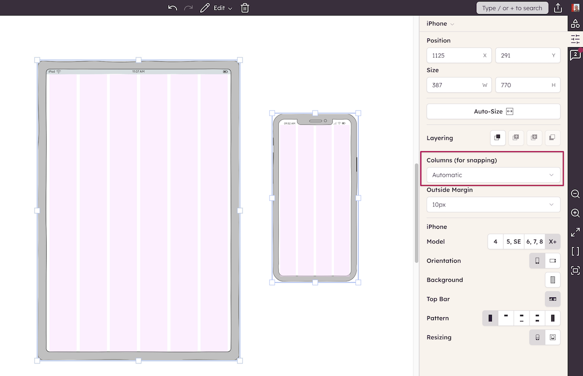
How to lay out controls using columns

1 min. read

The Balsamiq UI Library has a number of controls which are used as containers e.g. Browser Window, iPhone & iPad, Rectangle and Tabs. (Many user interface platforms and pattern libraries offer support for column layout e.g. Google Material Design)
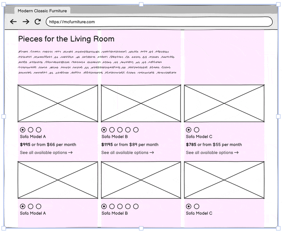
Containers allow you to snap other UI Controls to a grid of columns to help with alignment, and simplify the overall design process. Laying out webpages just got easier!
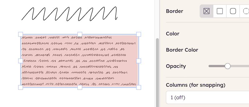
Align product listings into columns using container controls for clean, consistent layouts

Select any container control on the Canvas and you'll see the column properties in the Property Inspector:

Use column snapping in browser window containers to align text and images neatly.

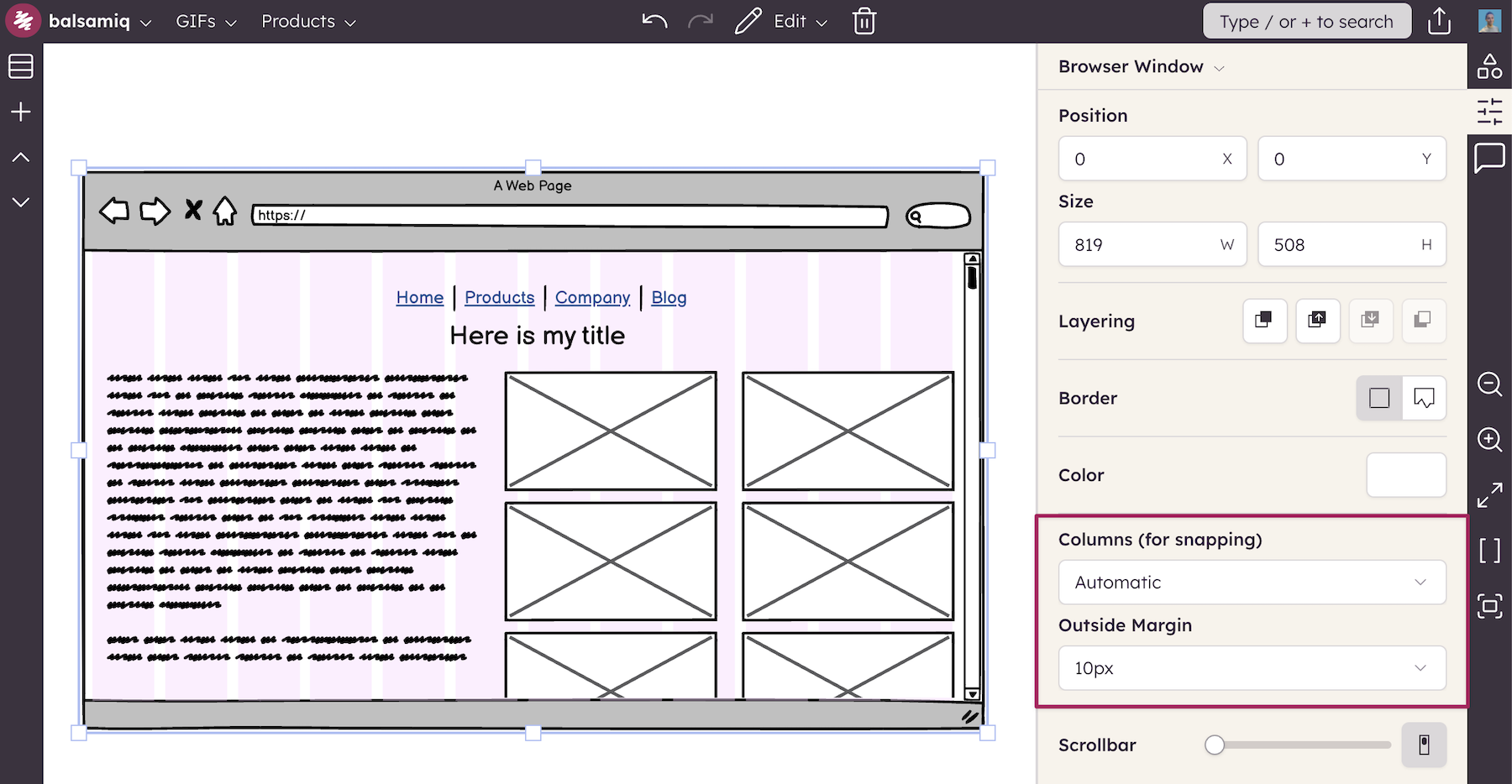
You can choose 1, 2, 3, 4, 6, 8, or 12 columns. If you select Automatic, we'll choose the appropriate number of columns based on the size of the control. You can also specify an Outside margin to center the columns inside the control.

Apply automatic column layouts to mobile containers for quick, responsive wireframing.
Author

Alasdair Manson
Alasdair Manson

Customer Success @ Balsamiq

Questions or feedback? Email alasdair@balsamiq.com.

Related articles


How to add a background color to any control

A trick to add backgrounds to any control in Balsamiq.

How to add a blank row to a combobox or menu control

A neat trick to add a blank row to two common Balsamiq controls.

How to keep form labels aligned

A neat trick to keep labels in Balsamiq wireframes aligned even after editing them.


Other topics you might be interested in

Our monthly emails will make you better at your job

Get our inside stories on product design, making things people love, and running a business built to last. Delivered once a month to your inbox.