This tutorial is designed to guide you through creating your first wireframe. It will cover a basic overview of the product as well as some of the features and UI elements.
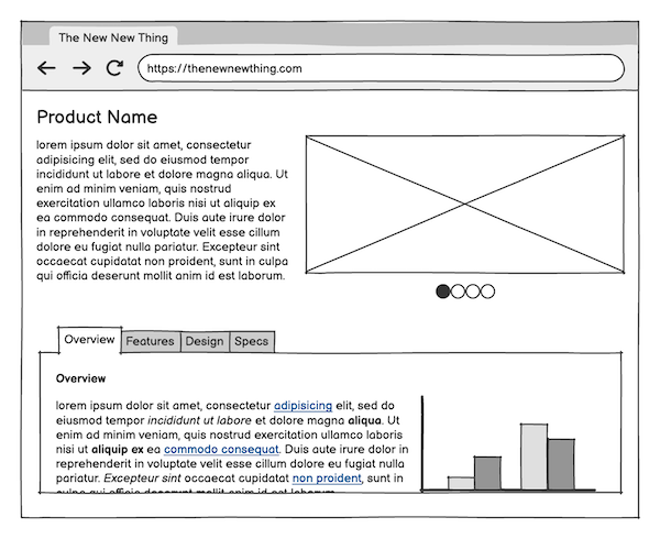
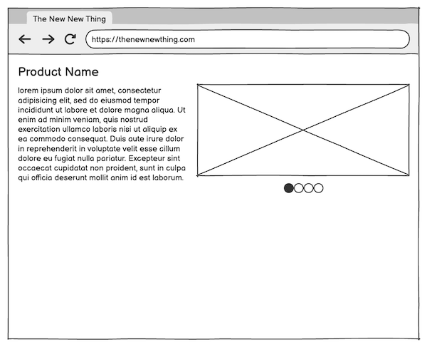
Here is the wireframe that you will create in this tutorial:
If you're new to the idea of wireframes, check out our article called "What are wireframes and why are they used?" to get an overview of what wireframes are, and where they fit into a UX Design process.
Basic concepts and terminology
Here are some of the basic components of Balsamiq:
- UI Element - A standard user interface "widget" (e.g., Button, Image, Dialog Window). The building blocks of any wireframe.
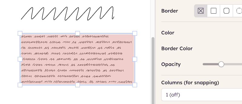
- Board - The grid-lined area where UI elements are placed.
- Selection toolbar - A floating toolbar that appears above a selected element, showing relevant actions (e.g. alignment, layering) and properties specific to each UI element.
Note: The Application Overview has more information about the UI elements in Balsamiq.
Adding the first few UI elements
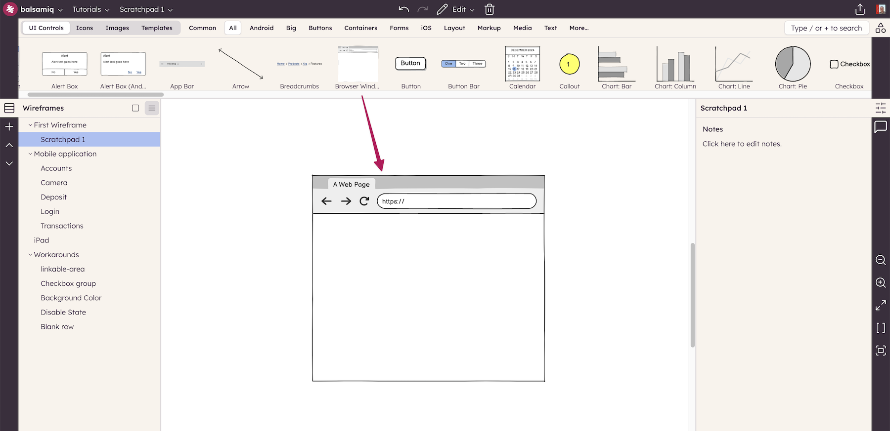
To create the wireframe shown above, let's begin by dragging the Browser UI Element onto the Board.
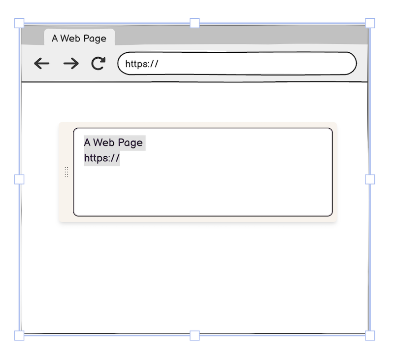
The content of nearly all UI elements in Balsamiq is defined by simple text. When a UI element is first added to the board, it will be shown in edit mode, often with hints about how to use it. For the Browser element, you can specify the title bar and URL text, or just use the default.
Tip: To edit a UI element at any time, double-click on it, or press Enter when it is selected.
Next, resize the UI element to the desired size using the resize cursor controls at the edges and corners of the UI element.
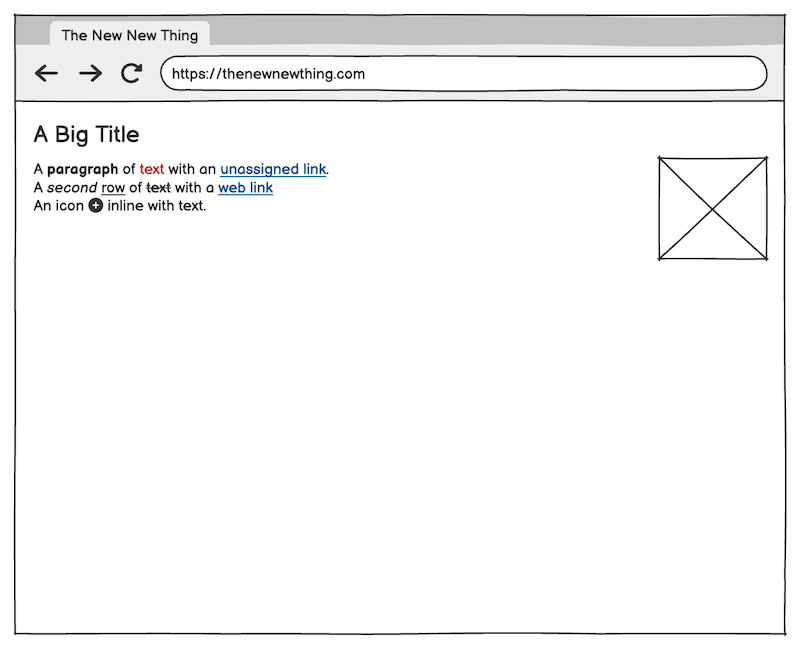
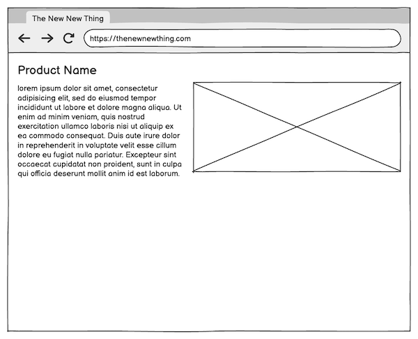
Continue by adding the following UI elements to the board: Title ("A Big Title"), Text ("A paragraph of text..."), and Image (the image placeholder) as shown below. Note that alignment guides appear just inside the edges of the Browser Window element when you move them toward the edges and that the elements "snap" to these guides.
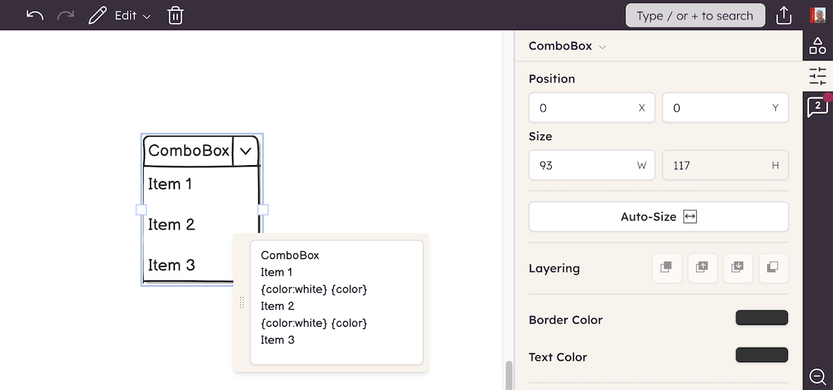
Tip: UI elements can also be added using the search box by typing the first few letters of the name of the element and pressing Enter.
To change the size of the text for the product name label, select the Title element and change the font size using the Property Inspector.
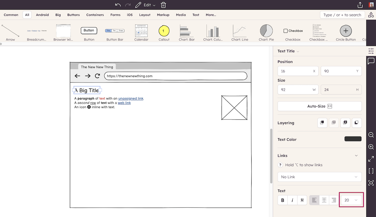
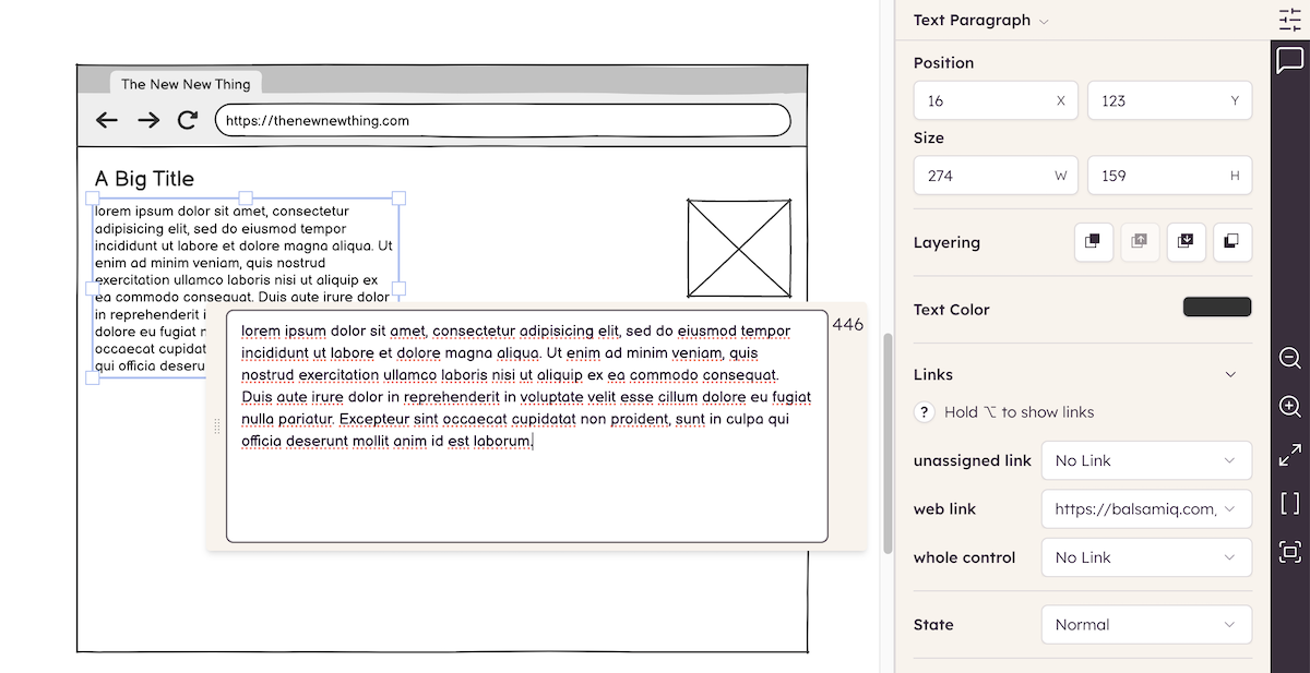
For the product description placeholder text in the Text element, enter your own placeholder text, or begin typing "lorem" and Lorem Ipsum text will automatically be generated.
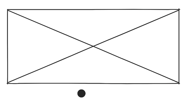
After resizing the Image element, your wireframe should look something like this:
Tip: If you have trouble selecting a UI element that is in front of another UI element, try "locking" the background element to prevent it from being selected.
Creating and aligning the image pager elements
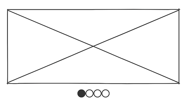
The next step is to add the little dots beneath the Image that indicate a rotating content or image element.
In this part of the tutorial you will learn about adding Icons and Grouping and Aligning UI elements.
Begin by adding the Icon element to the board.
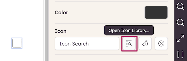
Next, click on the "Open Icon Library..." icon next to the "Icon Search" box.
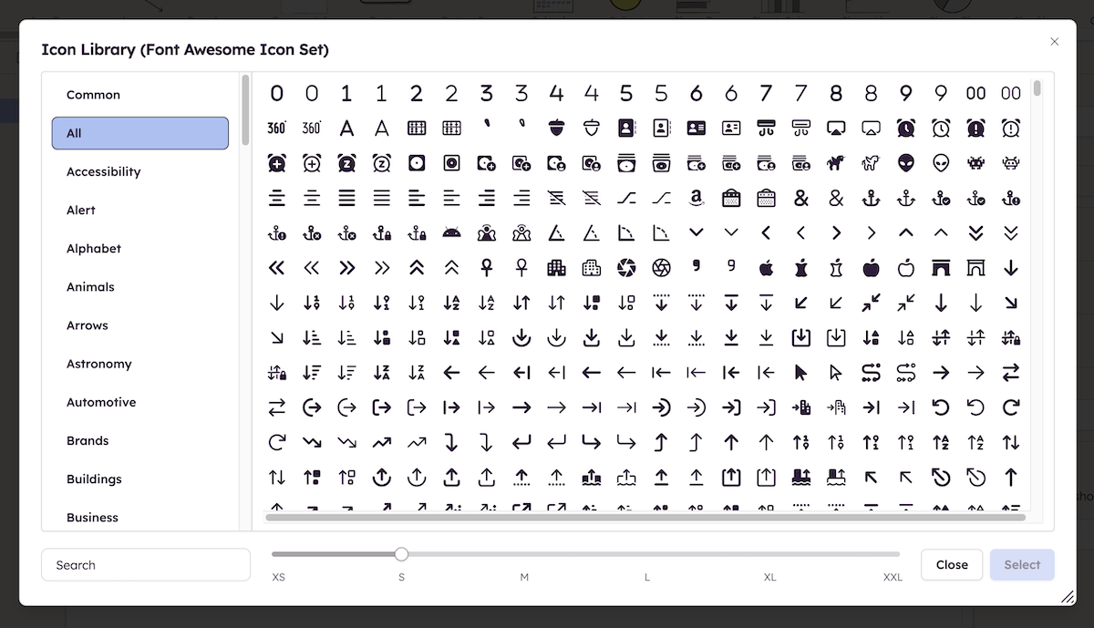
This window shows the list of all the icons included with Balsamiq. You can filter them by category or search by name. Once you have chosen an icon you can choose from one of six sizes. For this tutorial, select the Circle icon and set the size to "XS" and click "Select".
Tip: The "Icon Search" box in the Icon Property Inspector behaves like the search box and displays icons matching the text you enter (try typing "arrow", for example). Read more about adding icons and search.
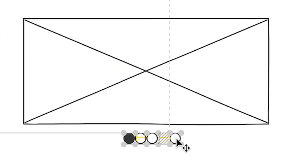
Add three more icons to the right of the Circle icon (use the Circle Outlined this time). You can also copy and paste once you've added the second icon. Using your mouse, position the icons next to each other. You can see that alignment guides appear both horizontally and vertically, helping you place them appropriately.
Tip: Use the Duplicate keyboard shortcut (CTRL + D on Windows; CMD + D on Mac) to quickly replicate items on the board. (More keyboard shortcuts.)
Zooming out, your wireframe should now look something like this:
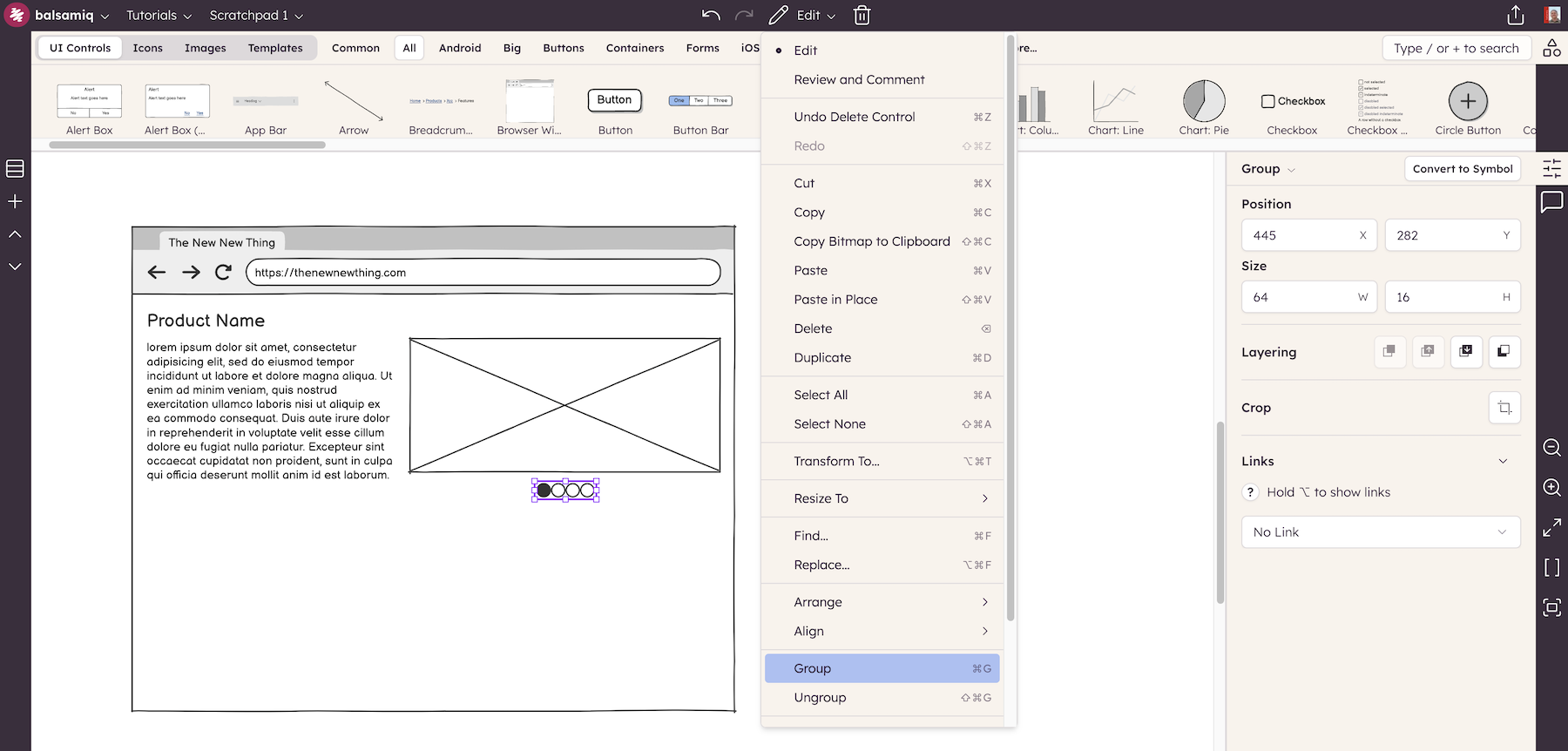
The next step is to center-align the four icons below the Image element. The procedure for doing this is to first group the icons and then align the icon group with the image element.
To group a set of UI elements, select them by drawing a boundary around them with your cursor or holding down SHIFT and selecting each one with your mouse. Then click the Group command from the Edit menu or press CTRL+G (on Windows; CMD + G on Mac).
Tip: Another way to select only UI elements that are in the foreground (besides "locking" background elements) is to hold down the ALT/OPTION key while dragging the mouse. This will prevent background elements from being selected.
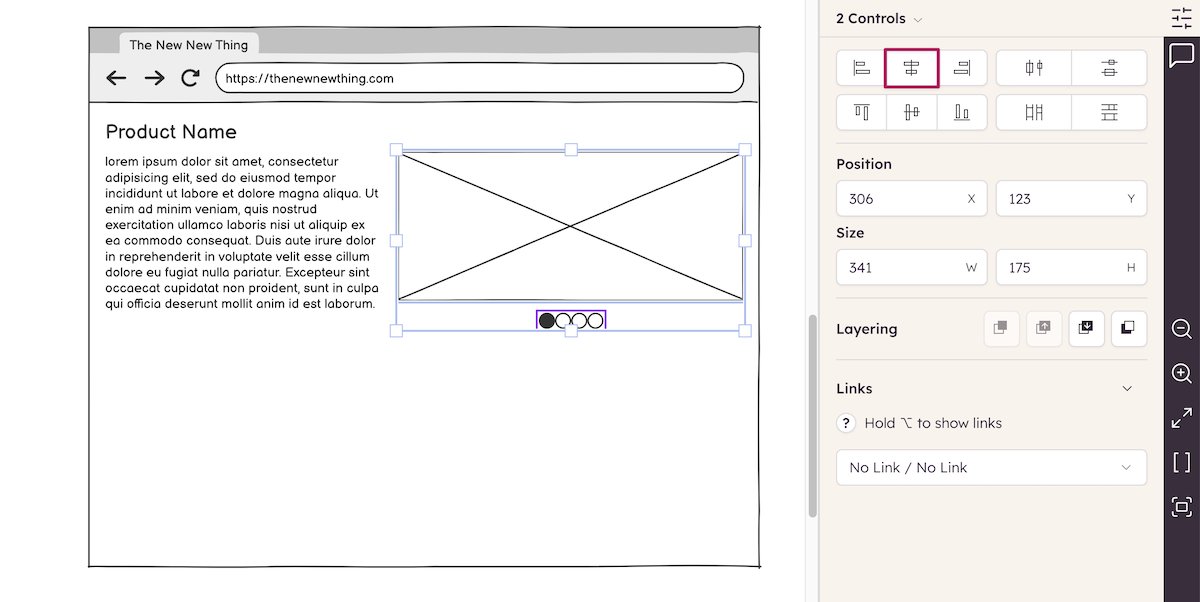
Grouped elements can be identified by a light purple color and will remain grouped until Ungrouped (shortcut: CTRL/CMD + SHIFT + G). To align the grouped icons with the Image element, select them both and use the Align Center icon in the Property Inspector.
You can move the pager elements closer to the Image element either by using the keyboard arrow keys or by using the mouse and the alignment guides.
Tip: Holding down SHIFT while moving UI elements with the arrow keys will move them 10 pixels at a time (instead of the usual 1 pixel).
The wireframe so far, with the pager elements added:

Completing the wireframe
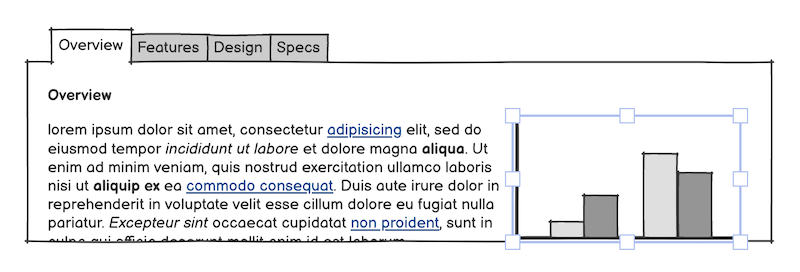
The remainder of the wireframes consists of a set of tabs, more text, and a chart.
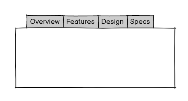
Add a Tab Bar element and place it in the bottom half of the wireframe.
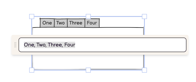
Commas are used to create tabs in this element, so you can create as many tabs as you like by entering additional text separated by a comma. Entering the text "Overview, Features, Design, Specs", for example, will create the tabs shown below.
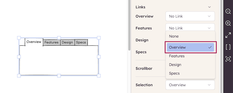
To show the "Overview" tab as selected or highlighted, use the Selection property as shown below.
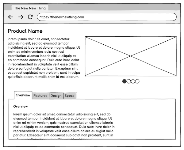
After resizing the Tab Bar element to match the width of the page, add Label and Text elements to create something like this:
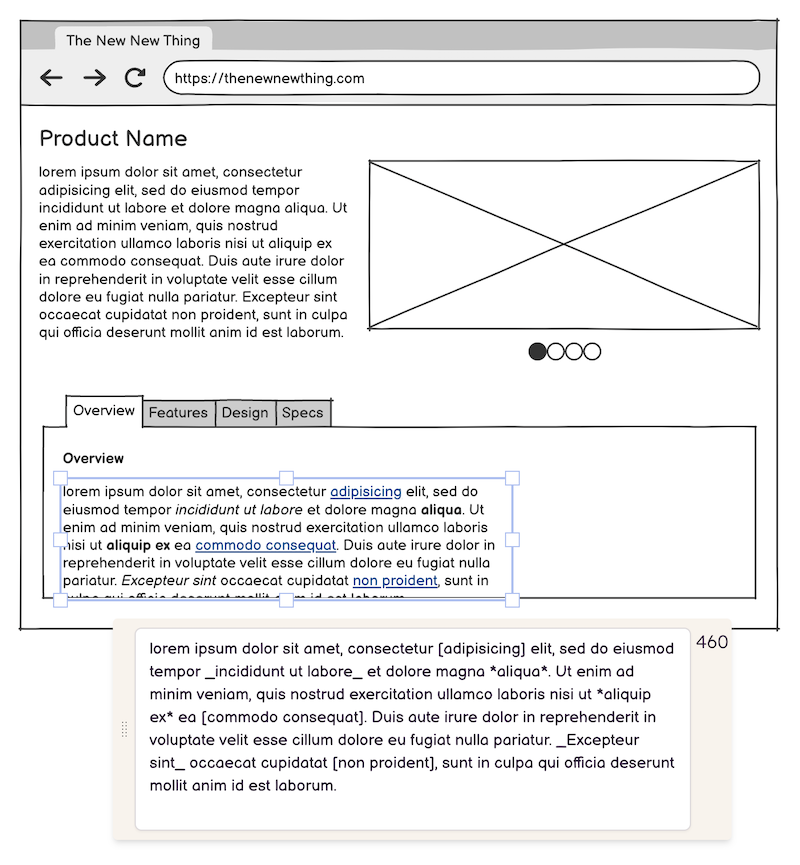
You can format text as bold, italic, or hyperlinked in many elements from the tex toolbar. More details on this page.
Finally, drag a Chart: Column element into the empty area inside the Tab Bar as a finishing touch to complete the wireframe.
Next steps
Now that the wireframe is finished, you can share it with clients or stakeholders. You can invite them to the project, share a public link, or export it to a PDF or images
Congratulations! You have now completed your first wireframe with Balsamiq! For more information on any of the topics covered here, see the full Balsamiq Documentation.
Learn more about wireframing!
Now that you've taken the first step in your wireframing journey, you can visit our Balsamiq Academy for courses, articles, and more.
Here are a few links that we suggest for people who are new to wireframing.

Introduction to user interface design through wireframes
This easy-to-follow course is intended for Product Managers, Entrepreneurs, and other non-designers who want to feel comfortable in the world of UI design.
How to start a wireframe project
Four techniques to start a wireframe project from scratch and ensure that you dedicate enough time to the ideation phase, where the success of your product begins.
Five steps to creating great wireframes
Good wireframes solve real problems and lead to strong products. From writing out the scenario to gathering inputs, here is a proven path to a great website or app.